
The amount of time we spend on our screens continues to increase across the globe every year. Whether we turn on our devices for work or pleasure, it’s no secret that most smartphone users are addicted to their screens.
However, too much screen time comes with its own set of problems. Our devices die quicker and our eyes suffer the consequences.
This is where dark mode comes in. As an alternative to a traditionally white, bright screen, dark mode, otherwise known as night mode, has been proven to reduce eye strain and improve long-term focus in comparison to brighter screens.
In 2024, a whopping 82% of smartphone users opt for a dark mode setting on their device display. For brands hoping to see UX success, changing your design in line with dark mode trends could be the answer to more engagement.
With this in mind, we’ve collated five brilliant ways to maximize your dark-mode UX for a website design that is ahead of the curve.
What Is Dark Mode?
Dark mode is a user interface setting that prioritises a darker colour scheme. This usually is a shade of dark grey or navy blue and is juxtaposed by lighter colours in the foreground.
The popularity of dark mode first rose in 2018 after Apple released the feature on macOS Mojave. Apple claimed that the setting helped reduce eye strain and saved energy for Mac users, and it was quickly adopted by consumers.
Since then, it has been picked up by platforms like Twitter and Spotify, revolutionising the way we view our screens in 2024.
Are More Brands Switching To Dark Mode?
As consumers demand more colour contrast options on their screens, more brands are releasing a dark mode version of their website to stay up to date with current UX/UI trends.
“In 2018, designers from SalesForce were wondering what mode was best when developing a dashboard feature. They interviewed many users and it turned out that users made decisions faster, and just as accurately, with charts displayed in Dark Theme,” says Olivier Berni, writer from UX Collective.
As more brands saw greater engagement potential with the introduction of the dark mode feature, many have adopted the new UI trend.
As one of the pioneers of dark mode, Twitter (now X) were one of the first to fully embrace the dark screen movement. Now set as the default setting for the platform app and website, many prefer the night setting to the traditional white screen.
Microsoft has also begun to offer dark mode for all of its platforms and features. For example, Microsoft Word users can now view all documents in the dark mode setting.
Dark mode has also made its way to the gaming world, as demonstrated by the popular game Halo, which uses the feature not only to improve late-night gaming but also to add a sense of mystery to its UI design.
Why is Dark Mode Important For User Experience?
So why is dark mode so important for your user experience? Well, apart from the obvious aesthetic benefits, dark mode can improve the health of both your device and your eyes.
Ultimately, when picturing your consumers, imagine them picking up their devices when the lights are off and thinking about how you can deliver a positive user experience at that moment. Would they prefer a brighter screen or a low-light alternative with less glare? We know what we would choose.

With accessibility now ranked as one of the most important web design principles in 2024, it’s time to introduce customisable web design to your UX strategy. Prioritising templates that can be used in dark and light modes will make your site accessible to all consumers, despite their preferences.
Here are some of the benefits a dark UX could offer your consumers:
Improving Computer Vision Syndrome
Computer vision syndrome (CVS) is a syndrome of the eye often caused by prolonged exposure to a digital screen. Otherwise known as digital eye strain, those who use a smartphone or computer device regularly are most likely to experience symptoms of fatigue and dry eye.
Transitioning to a darker screen can help reduce this, according to experts at Google. After seeing a rise in CVS amongst workers, 82% of the workforce has seen significant improvement after switching to dark mode.
“That may be the real reason for the rise of dark mode. Sucked into the soothing blacks and greys, you’re less likely to put your phone away. Twitter, for example, found that users spent more time in its app when dark mode was turned on. You’re less likely to notice that your eyeballs have dried out from staring into your screen,” says Wired’s tech expert, Arielle Pardes.
Boosting Battery Life
Did you know that switching to dark mode can boost battery life by 63%? If you want to save your consumers switching screens every few hours, battery life is another reason to add dark mode to your design strategy.
Consuming six times less power than lighter alternatives, dark mode design benefits both your audience and the planet.
5 Ways To Improve Your Dark Mode Design
Adding dark mode to your UX/UI strategy is essential if you want to stay ahead of web design trends in 2024.
The key here is to offer your demographic a choice when it comes to choosing their UX features. Offering the option to change their screen to dark mode promotes site accessibility and could set your engagement stats soaring.
Here are five dark mode design tips to consider when you make the switch.
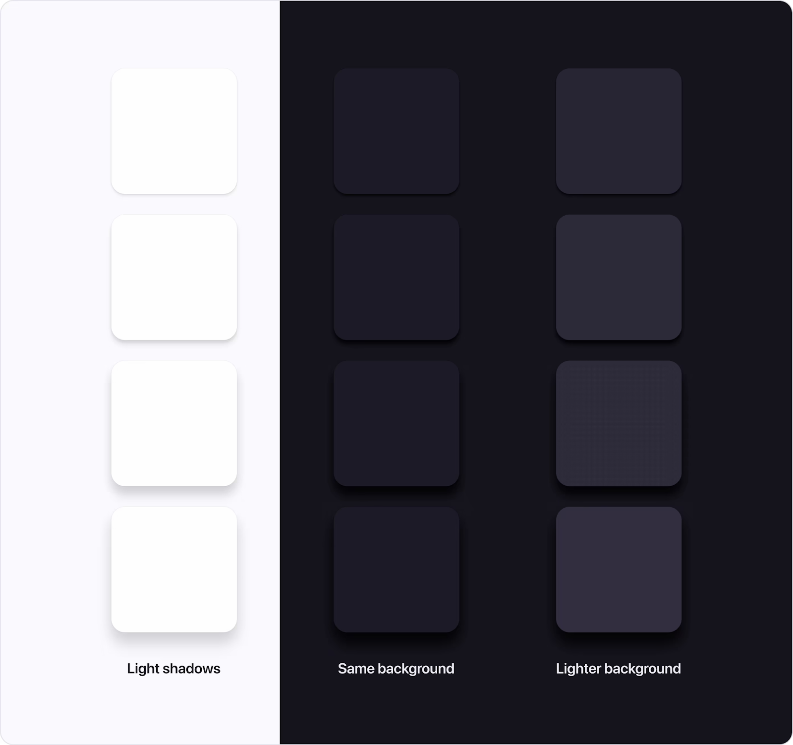
Avoid Solid Black
A solid or ‘pure’ colour is one that does not contain any grey within its colour mix. For example, black (#000000) is the darkest colour you can choose when creating a UX theme, however, we strongly recommend against it when designing for dark mode.
While you’d certainly be opting for a darker screen, pure black can provide too heavy of contrast against other colours, actually causing eye strain rather than reducing it.
(Image Source: Halo)
Instead, we suggest that you opt for a dark grey when designing for dark mode. This colour can be layered seamlessly with lighter shades and whites for a comfortable user experience.
Say No To Saturation
Over-saturated colours are also a no-go when it comes to dark mode design. When choosing your accent colours, opt for faded versions of bold shades. Using split complementary colours can help you find the best contrast shades.
Ensure that you include a few contrasting colours within your dark mode design to help improve readability. For example, Google recommends one dominant colour and two adjacent shades for the best results.
“Use strongly contrasting colours to improve readability,” Apple suggests. “Many factors affect the perception of colour, including font size and weight, colour brightness, screen resolution, and lighting conditions.”
Make Your Focus Indicators Visible
Your focus indicators are the visual highlights that appear when a user’s cursor hovers over the screen.
These should be visible in all UX designs to help improve navigation and usability on site.
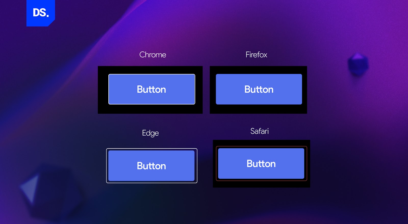
(Image Source: DS)
For darker UX/UI web pages, ensure that your focus indicator colour contrasts well with the background colour. As you can see in the examples above, some designs opt for a darker-coloured highlight, while some opt for a lighter alternative.
Adapt Your Brand Colours
While the dark mode is an essential UX feature, you should not compromise your brand colours in their place. It’s much better to adapt these to your dark theme, allowing your brand to preserve its known identity moving forward.
The key here is to use the same colours that are seen in your light mode version but rectified to improve contrast in a dark mode setting.
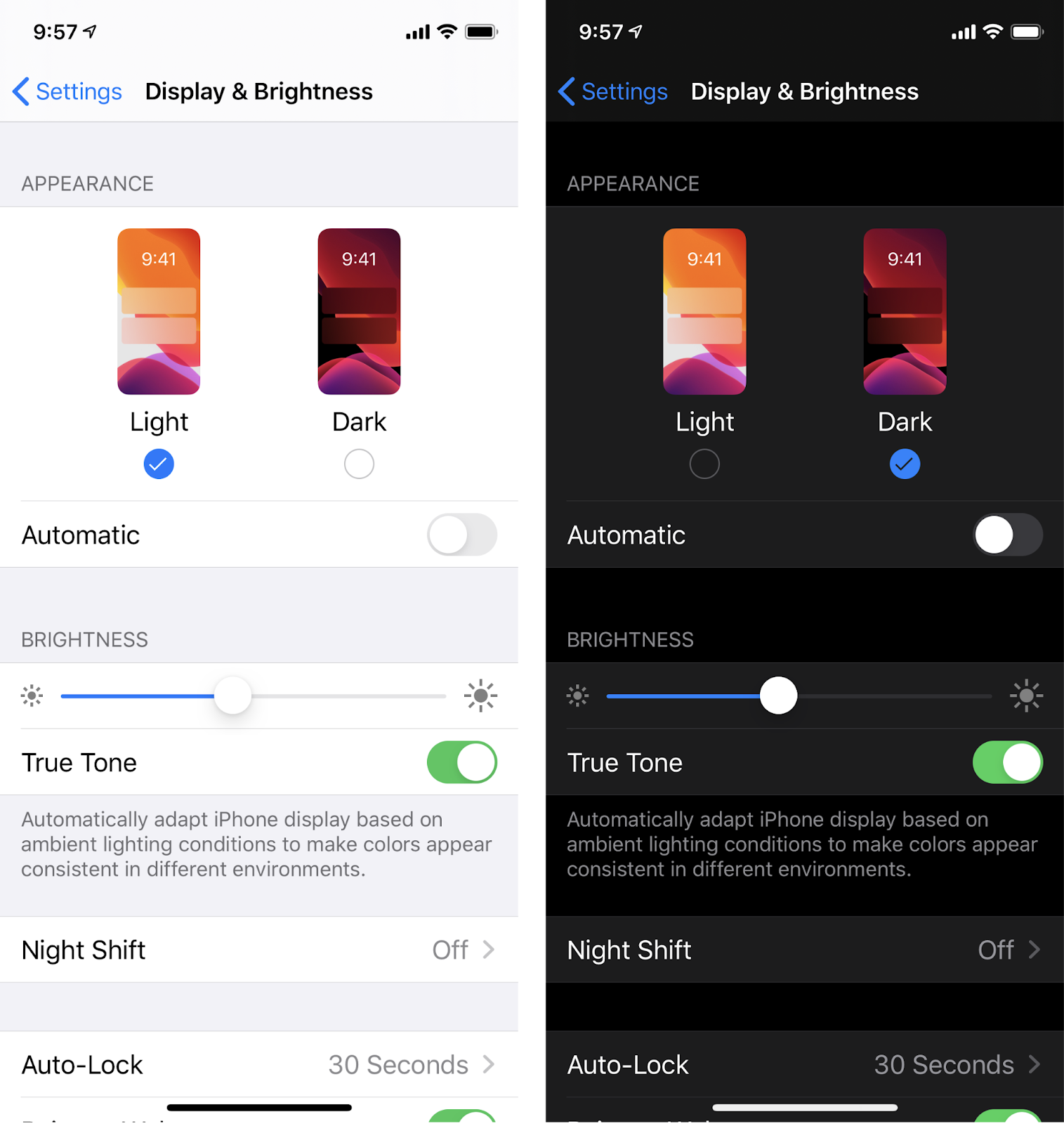
(Image Source: Apple)
Take Apple, for example. They are brilliant at creating a dark and light mode design that still features the same colours, just at different saturation levels.
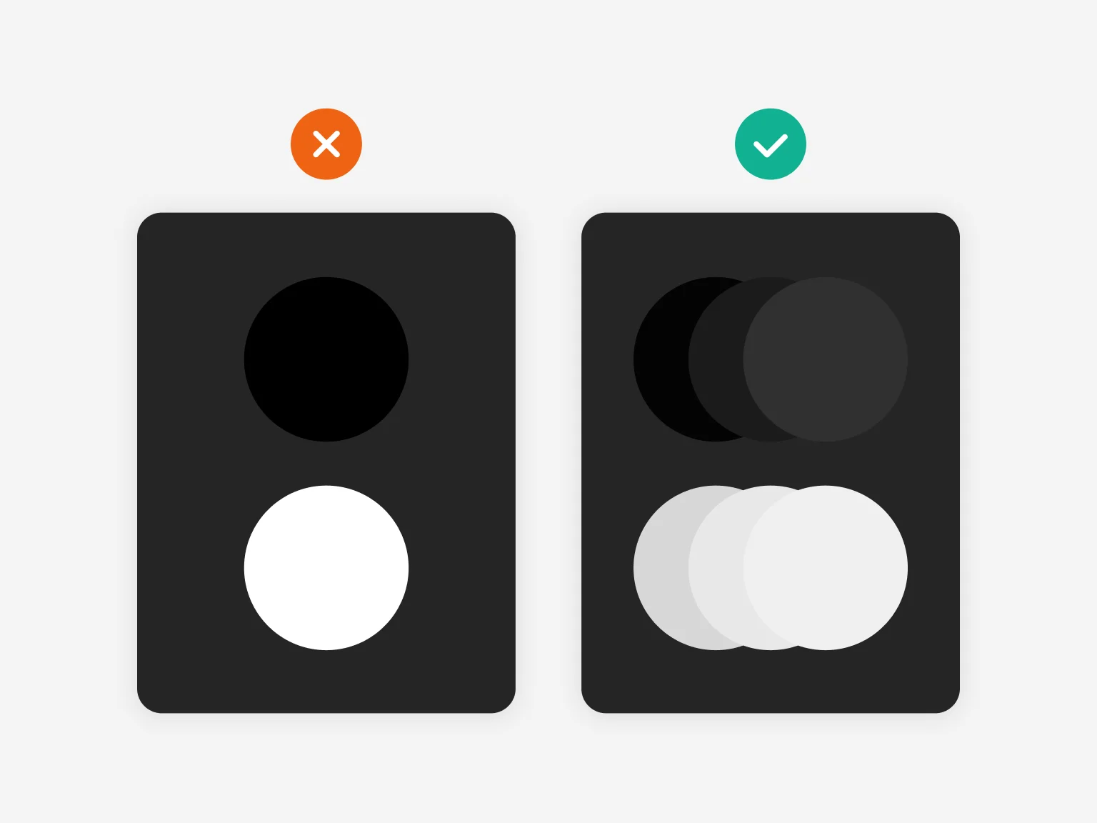
Communicate Depth With Your Design
Last but not least, ensure that your dark mode design still incorporates shadows and highlights in the same way as a traditional light mode alternative.
While light mode designs use a ‘light source’ method to help cast shadows on certain elements, dark mode designs do this by making the elements at the top of the surface lighter to emulate natural lighting on the screen.
(Image Source: Atmos)
As you can see here, you can see that designs that prioritise effective lighting stand out much clearer to the eye, promoting a better UX experience.
Wrapping Up
As we step into a new era of UX/UI design, dark mode will continue to dominate branding trends across the globe.
With dark mode now accessible on most devices, following suit with your website and or app design will allow for seamless movement between content for consumers.
Not only will users spend longer on a website they can customise to their taste, but you’ll sit ahead of the curve as we wait for more brands to enter the dark side in 2024.